Client
Flügn
Year
2025
Deliverables
Brand strategy, positioning, visual identity and applications.
Overview
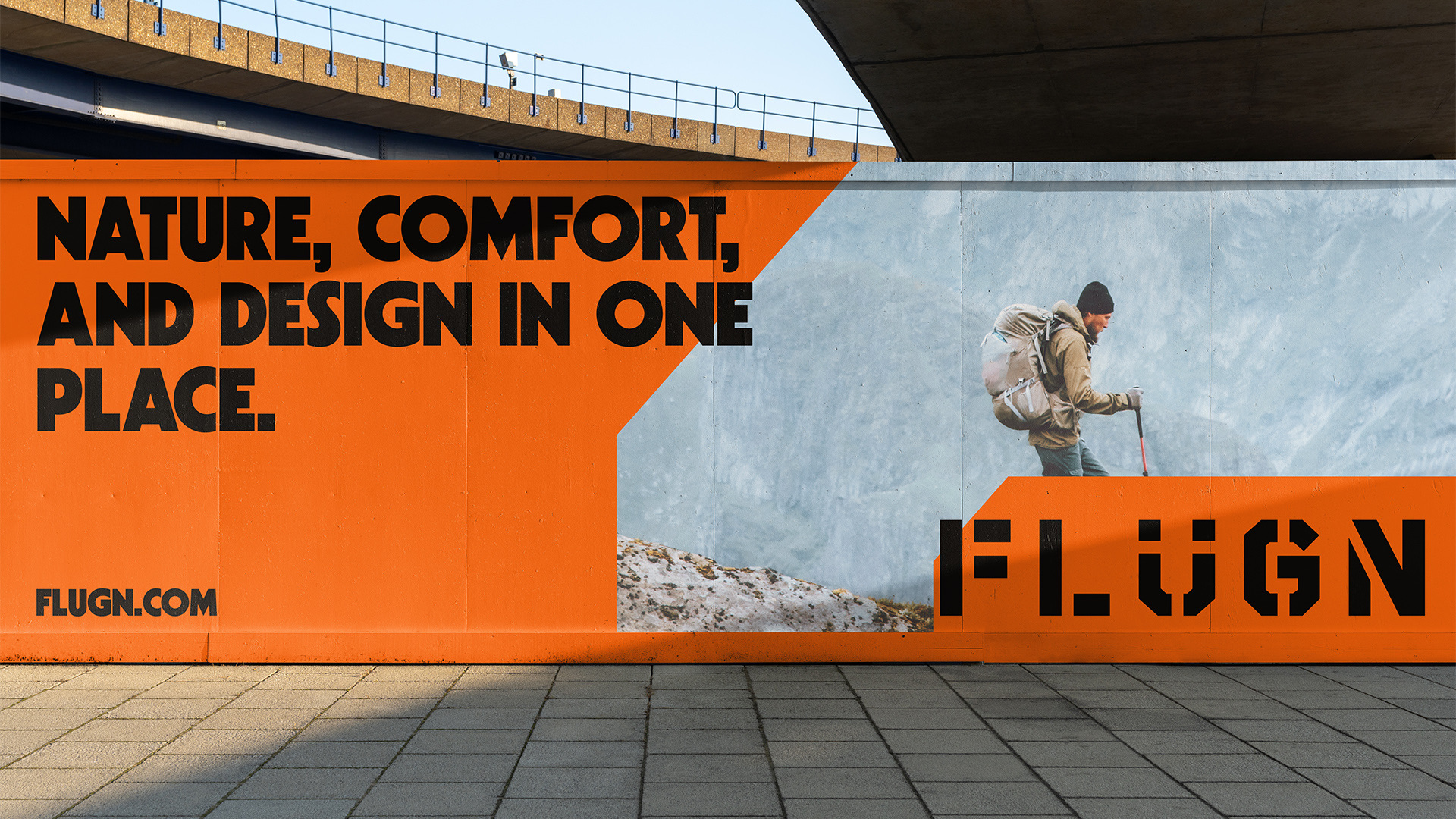
Flügn brings together equipment and accessories for camping, adventure, wellness and lifestyle. Inspired by the European meaning of its name, the brand sets out to bring people closer to nature with products that combine freedom, comfort and contemporary design, for those just starting to explore and for those who already live outdoors.
Challenges
The outdoor world tends to speak to specialists and repeat a predictable aesthetic. Flügn needed to be bold and accessible at the same time, conveying premium quality and technology without distancing itself from those taking their first steps into adventure.
Approach
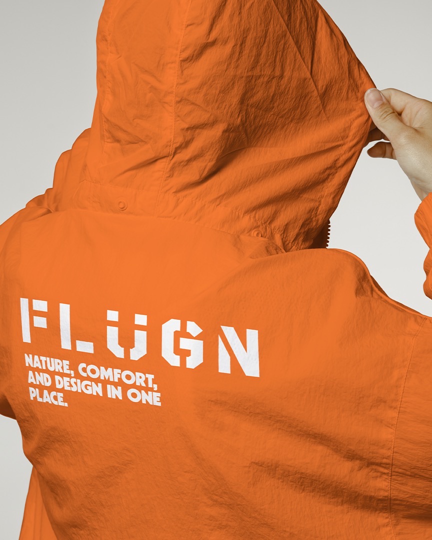
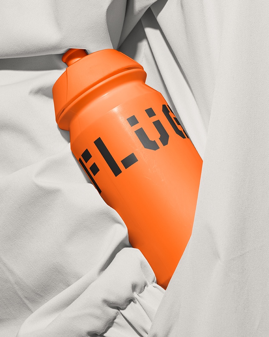
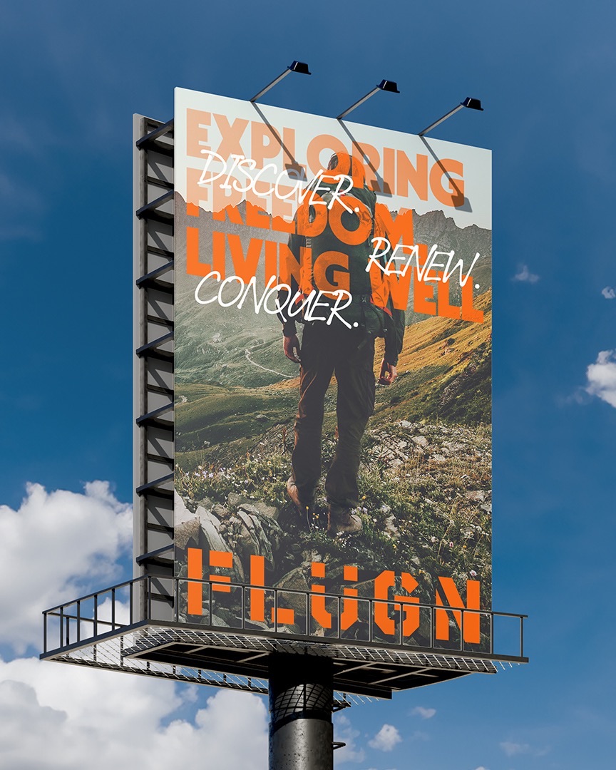
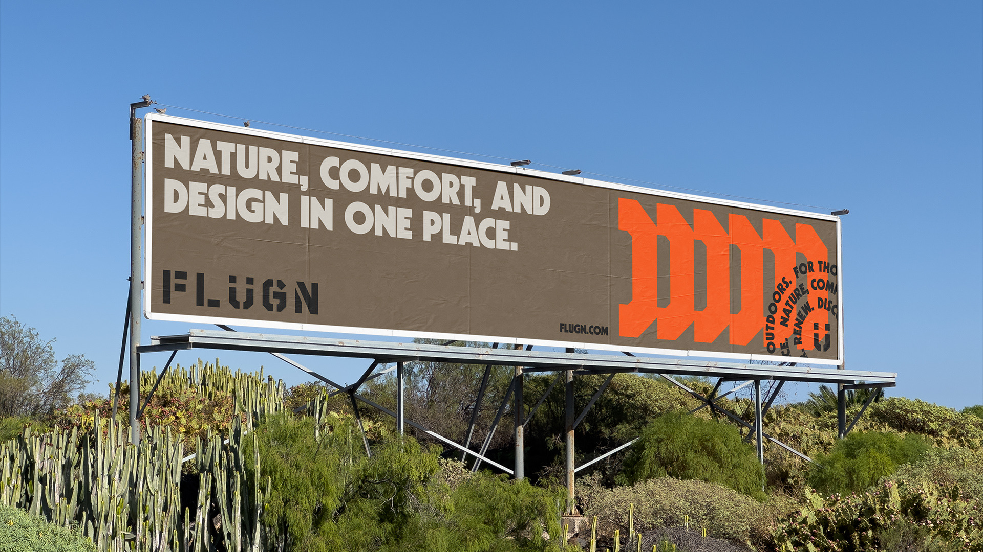
The strategy defined a modern, vibrant and reliable personality, guided by the Explorer and Creator archetypes. The logotype uses geometric, modular lettering, with right angles and cuts that suggest movement and openness, highlighting the “Ü”. The cuts in the letters become patterns, dividers and frames, and orange, supported by brown, beige and black, brings energy to the whole system.
Result
A brand with a strong, recognizable presence that carries freedom, Scandinavian design and functionality across every touchpoint, from apparel to bottles, backpacks and campaigns, and positions Flügn as a new kind of outdoor luxury: democratic, authentic and full of personality.
01 / 12
Next
project
Flint
Contact
Let's talk.
Phone
+55 83 99362-8283Every brand starts with a challenge. Tell us a little about your business, your ideas and what you want to build. We'll get to know your project and see how we can help.