Client
Muna
Year
2026
Deliverables
Brand strategy, custom-drawn logotype, symbol, visual identity and applications.
Overview
Muna is an authorial brand, guided by its own taste and still building its public presence. Reserved by nature, it wants to grow without giving up what makes it unique: what it chooses and what it lets pass.
Challenges
The greater the exposure, the greater the pressure to adjust to whatever draws attention. The challenge was to create an identity that would let Muna be recognized without letting visibility decide who it is, and to stand apart without relying on the familiar codes of luxury.
Approach
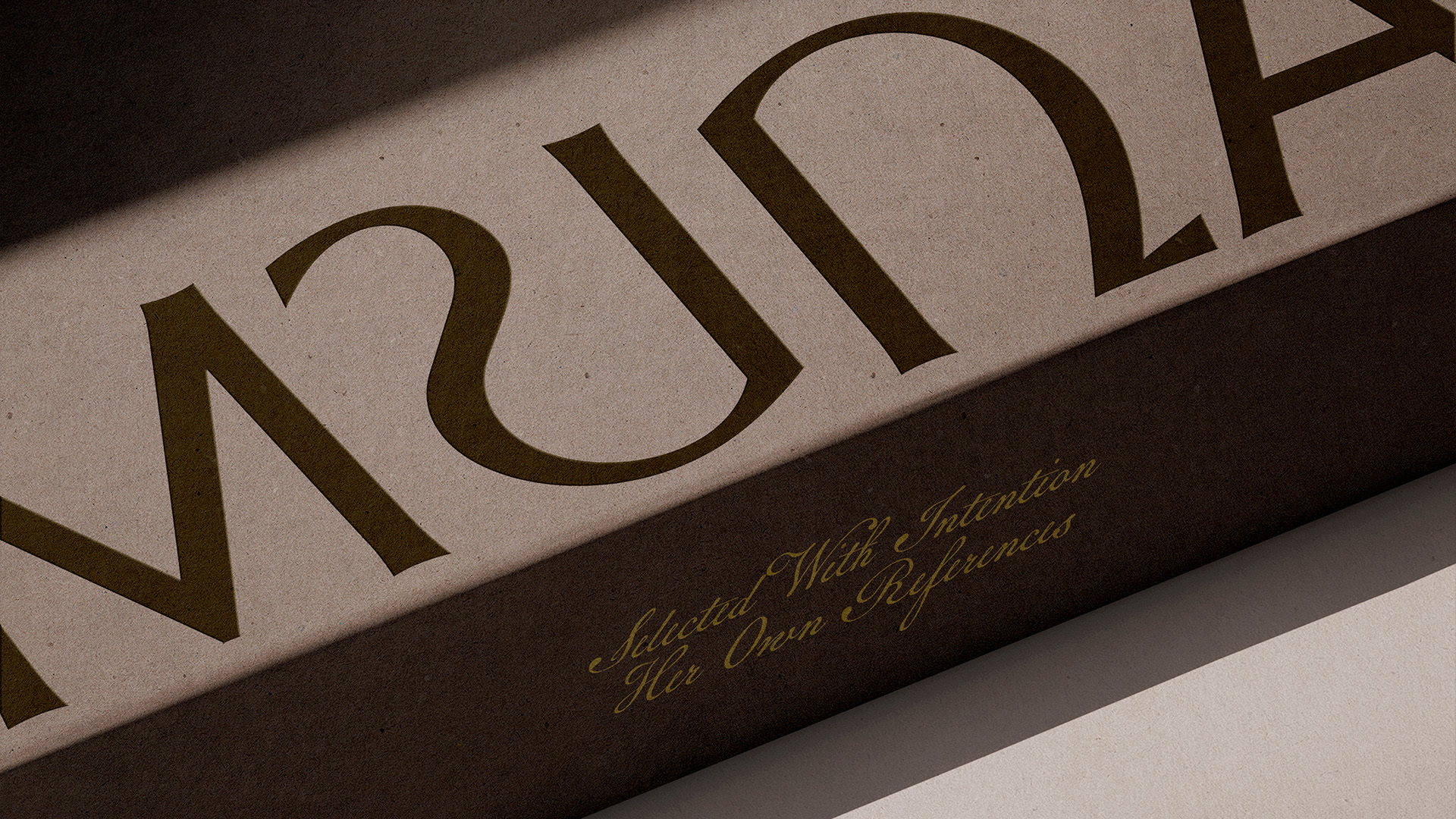
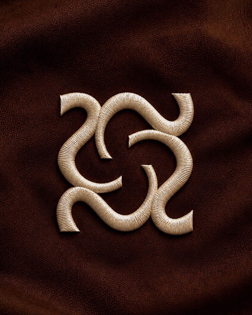
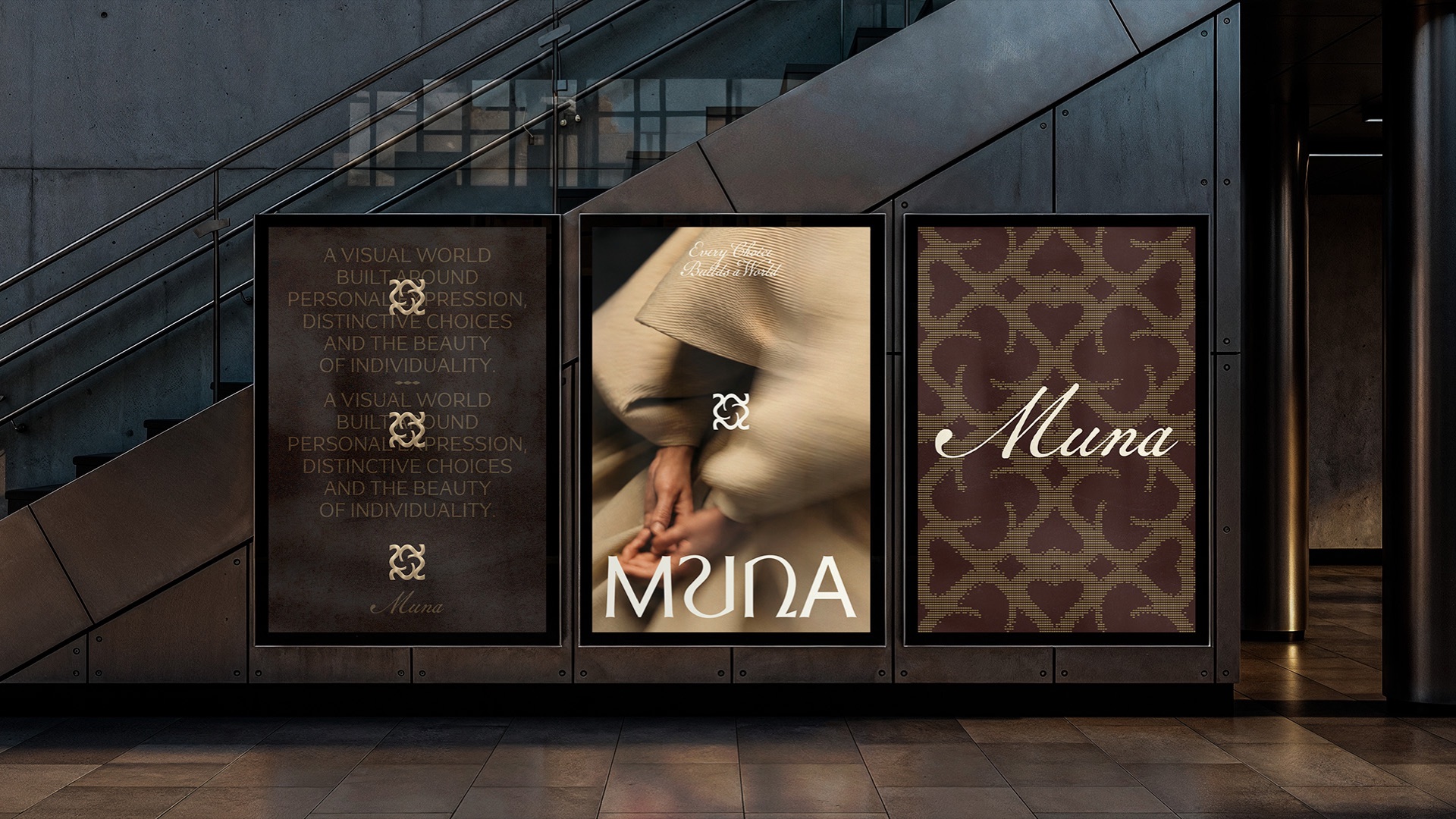
The logotype was drawn from scratch: thin and thick stems alternate, the curves are wide and the U and the N share the same curve. That curve gave rise to the symbol, whose four arms interlock from a single quarter rotated four times. The palette brings together five warm, low-saturation tones, from dark green to cream, and the supporting typography accompanies the name without competing with it.
Result
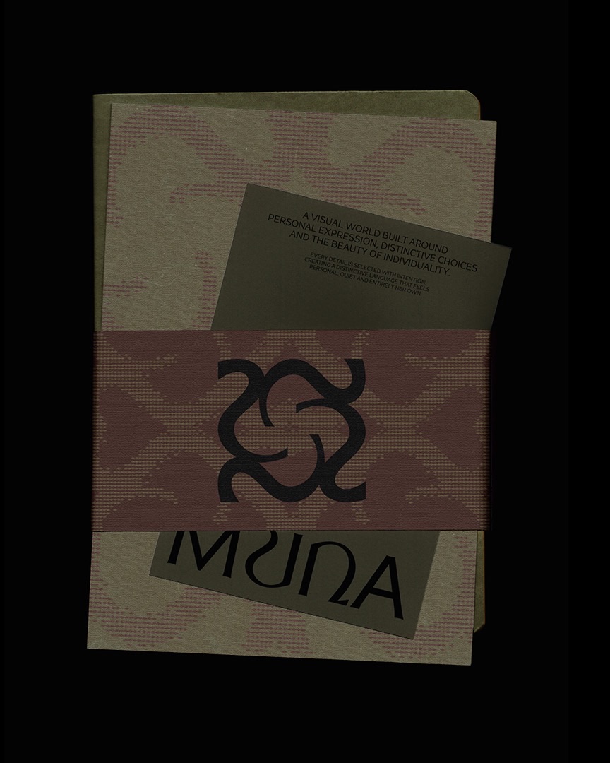
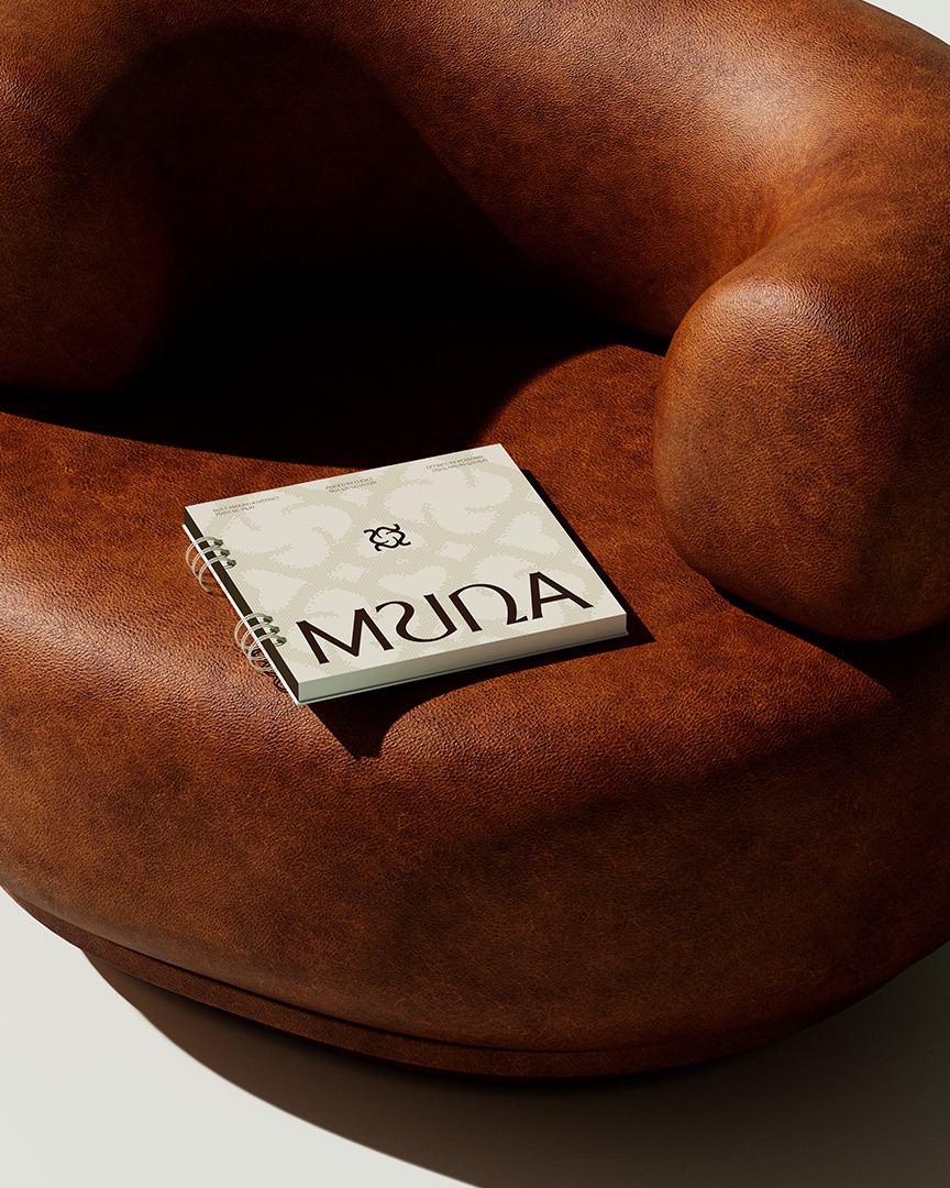
A system built on its own criteria, with signatures, patterns and textures born from the same symbol. The identity adapts to different categories and scales without losing its origin and makes Muna's world recognizable in every choice.
01 / 17
Next
project
Flügn
Contact
Let's talk.
Phone
+55 83 99362-8283Every brand starts with a challenge. Tell us a little about your business, your ideas and what you want to build. We'll get to know your project and see how we can help.