Client
Salada
Year
2024
Deliverables
Brand strategy, naming, visual identity and packaging.
Overview
Salada is a company dedicated to producing fresh, flavorful vegetables, grown on a large pesticide-free area. The brand was born with the purpose of bringing the best of nature straight to consumers' tables, bringing together quality, health and everyday eating.
Challenges
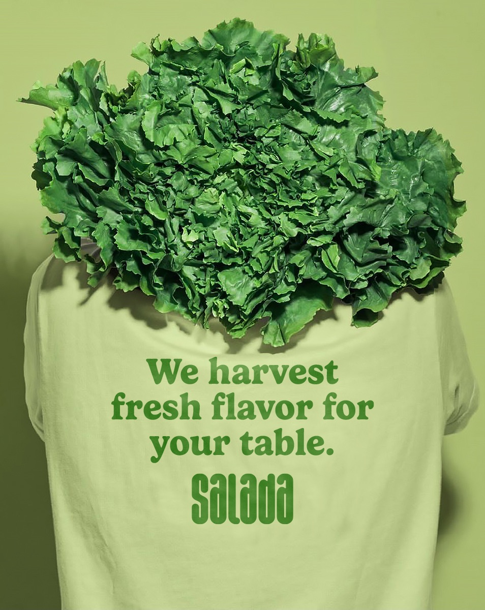
The challenge was to communicate the company's commitment to quality, flavor and health in a clear, trustworthy way. The identity needed to convey the seriousness of a producer that values care at every stage, without losing the lightness and freshness expected of an everyday food brand.
Approach
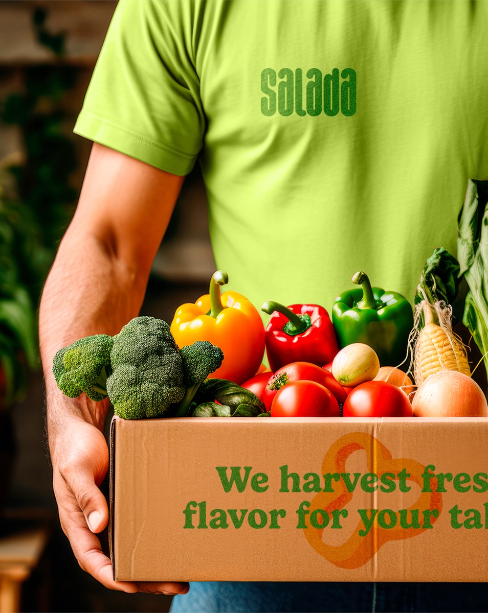
The strategy was built on four pillars: quality, freshness, health and sustainability. These attributes guided an identity that balances credibility and approachability. The typographic logo features strong, friendly and modern letters, organized on a grid that keeps the whole consistent. Custom illustrations, inspired by the vegetables themselves, add a youthful touch to the visual language and bring the brand closer to its products.
Result
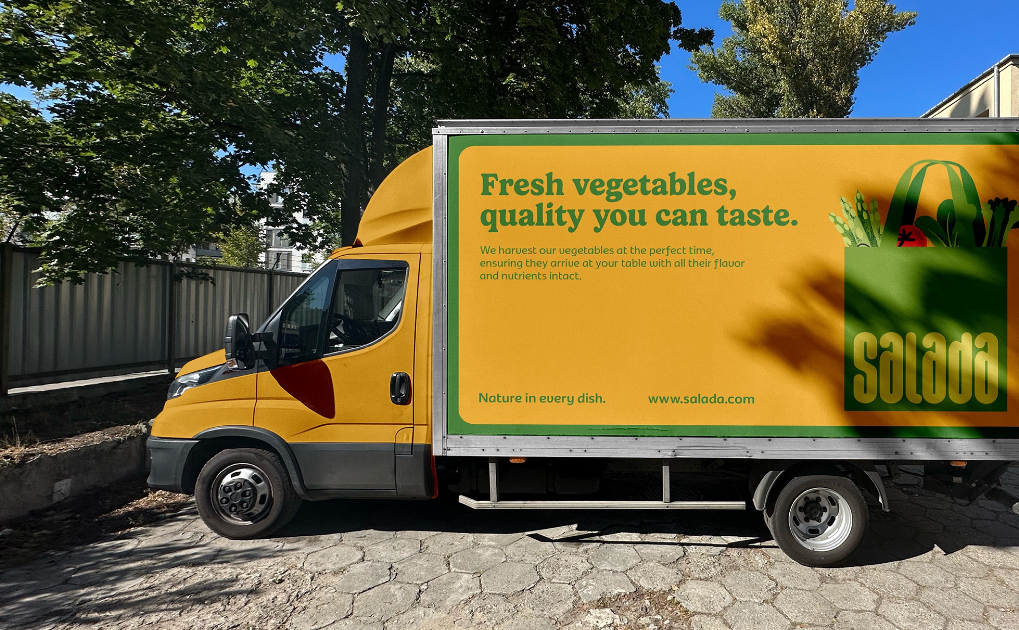
A cohesive identity that conveys Salada's commitment to producing fresh, healthy vegetables. The combination of typography, colors and illustrations creates a visual language of its own, able to communicate quality and freshness with lightness and strengthen the brand's recognition in its market.
01 / 14
Next
project
U Pizza
Contact
Let's talk.
Phone
+55 83 99362-8283Every brand starts with a challenge. Tell us a little about your business, your ideas and what you want to build. We'll get to know your project and see how we can help.