Client
U Pizza
Year
2021
Deliverables
Logo and visual identity.
Overview
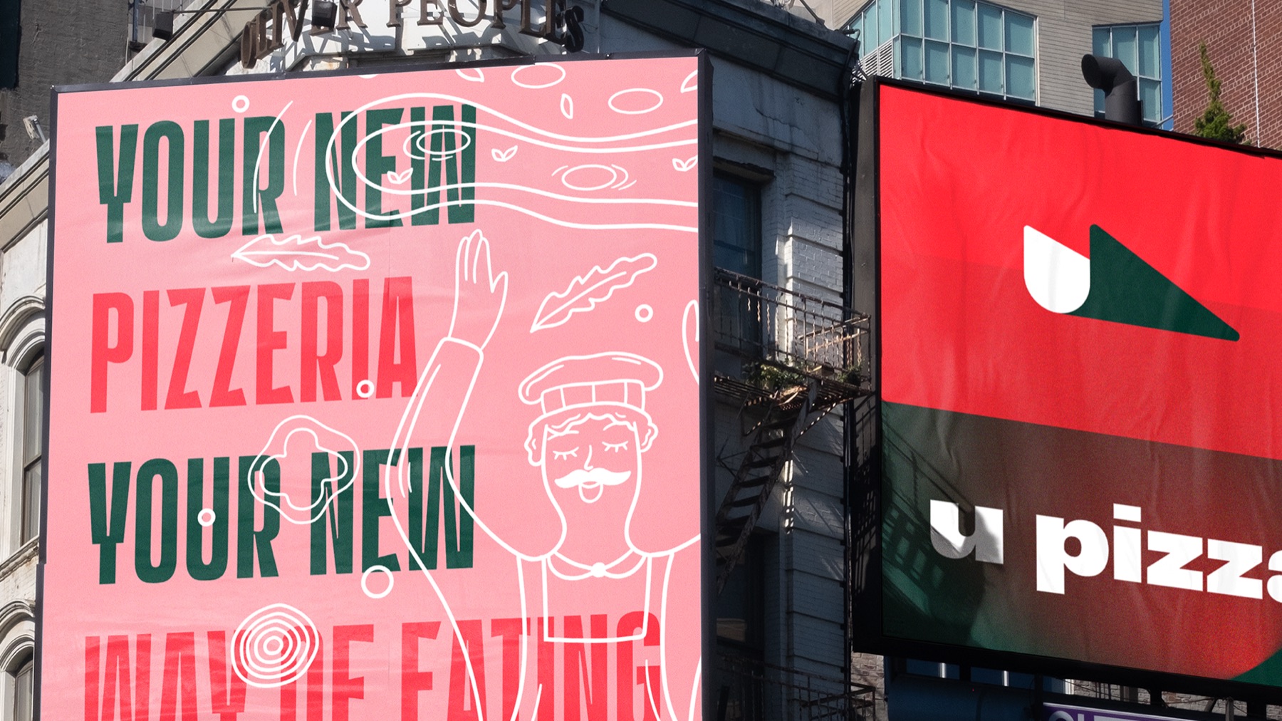
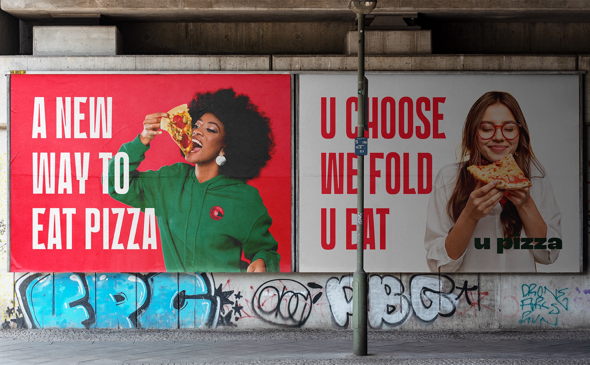
U Pizza is a pizzeria in Kuwait that offers a different way of eating pizza. Instead of the traditional round format, its slices are served folded, letting customers choose their topping and try different combinations more easily.
Challenges
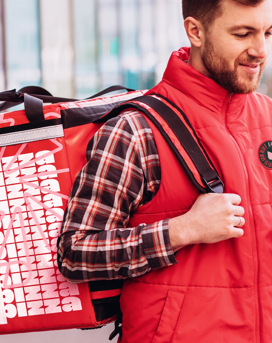
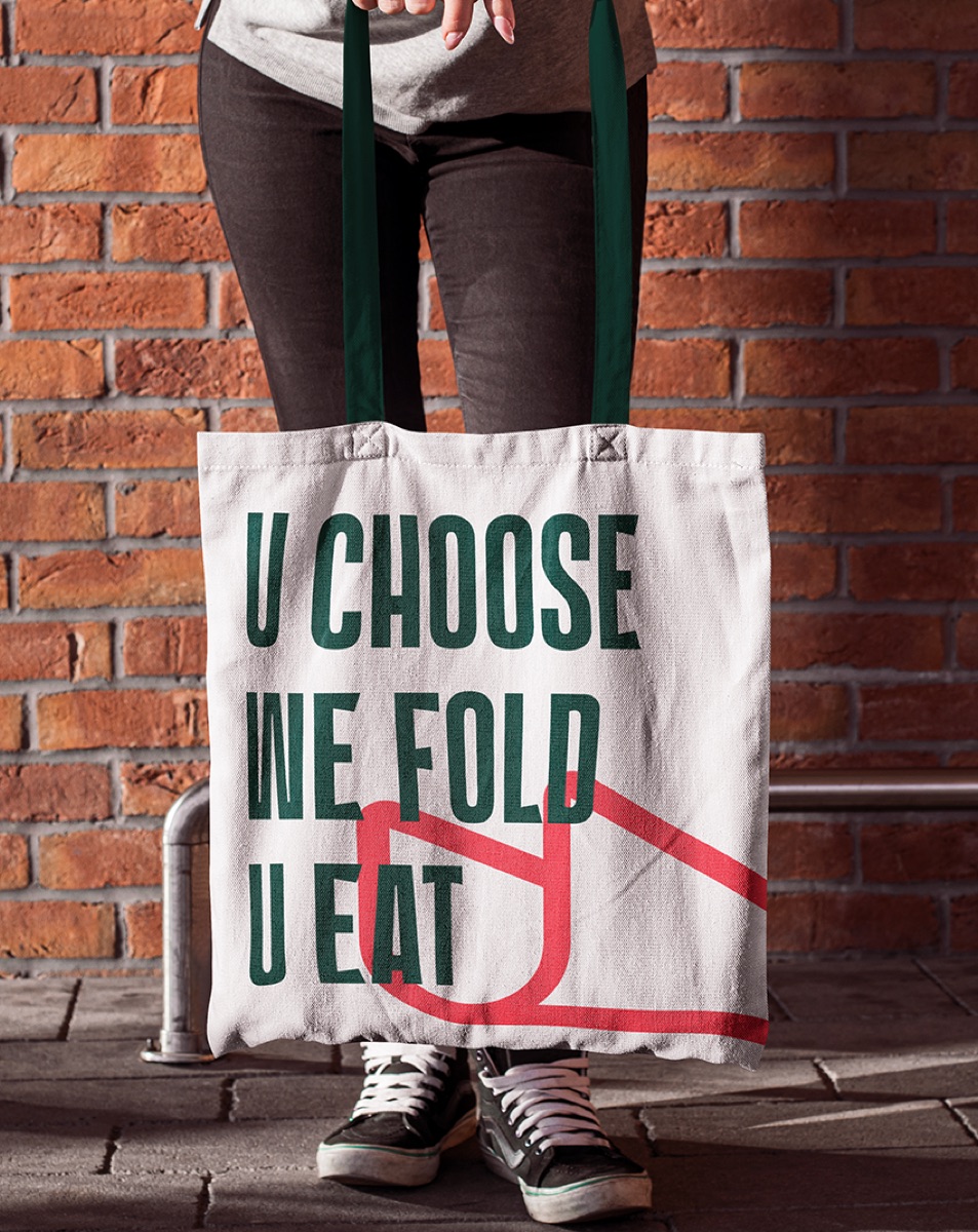
The brand needed to communicate this proposition quickly, making the product's format easy to understand and recognize. In a market full of pizzerias with similar language, the challenge was to build an identity able to highlight the experience U Pizza offers and set it apart from traditional options.
Approach
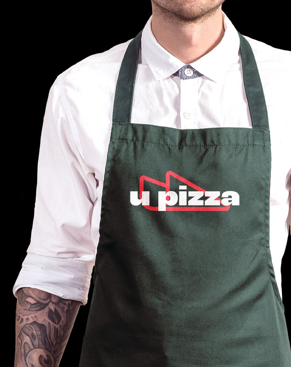
The shape of the folded pizza recalls the letter “U”, an association that gave rise to the name and to the central concept of the identity. This relationship between product and brand guided the development of a visual system of its own. Colors, textures, illustrations and typography were combined to expand the graphic world and reinforce U Pizza's personality, keeping the product as the central reference of the communication.
Result
A bold, recognizable visual identity that turns the product's most distinctive feature into a central element of the brand. The connection between format, name and visual language creates an expression of its own for U Pizza and sets it apart in the pizzeria market.
01 / 25
Next
project
Sáltea
Contact
Let's talk.
Phone
+55 83 99362-8283Every brand starts with a challenge. Tell us a little about your business, your ideas and what you want to build. We'll get to know your project and see how we can help.