Client
Sáltea
Year
2026
Deliverables
Brand strategy, visual identity and packaging design.
Overview
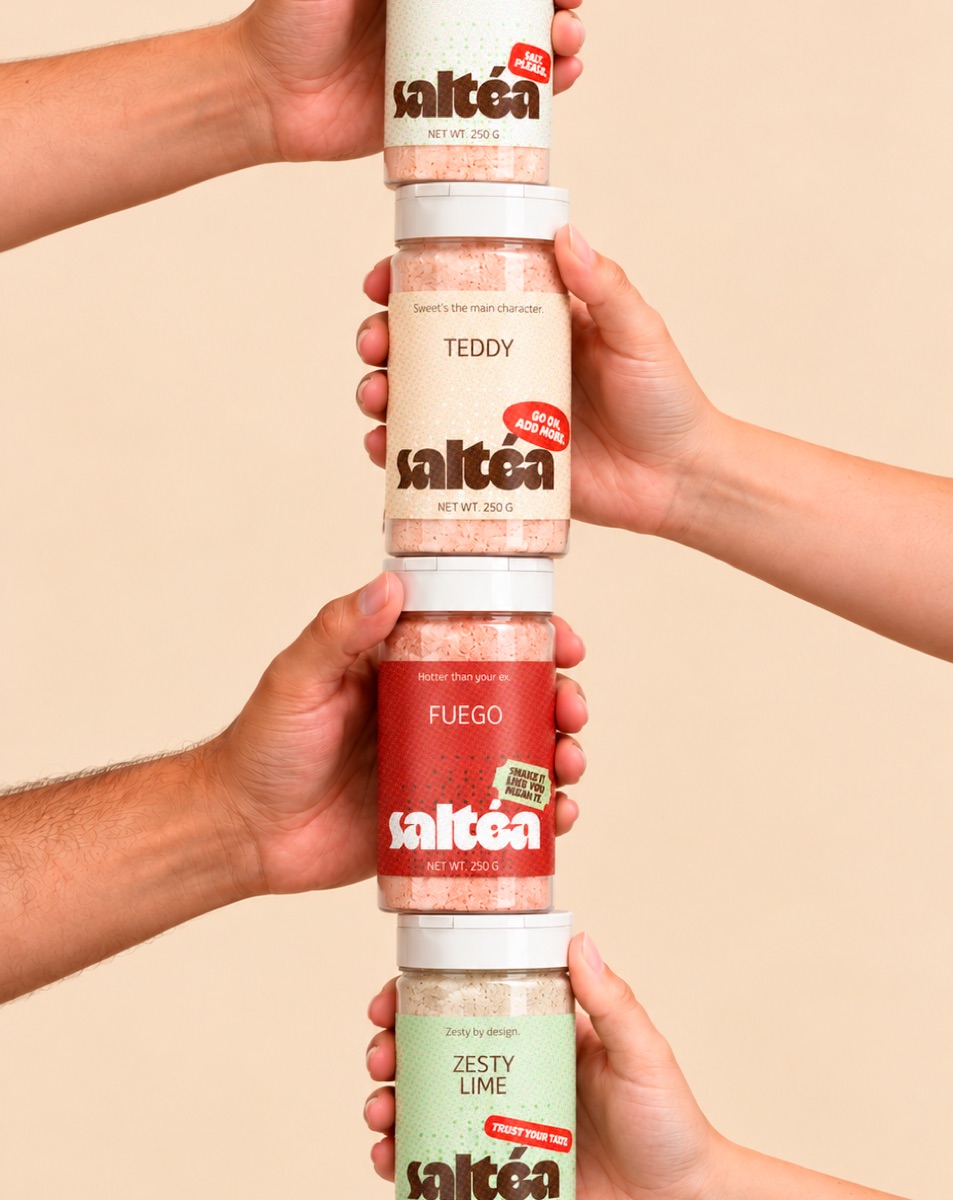
Sáltea is a premium cooking salt brand built on a simple idea: small details can transform an experience. The project set out to reposition an essential everyday ingredient as a brand with a personality of its own, bringing together gastronomy, expression and creativity.
Challenges
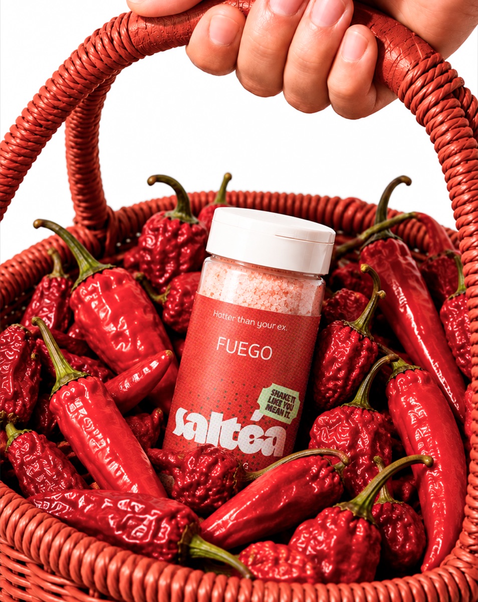
Found in almost every kitchen, salt is usually presented in a functional way, with visual identities that rarely explore its potential as an experience product. The challenge was to build a brand able to stand out in this category, raise the product's perceived value and create a more expressive connection with people who love to cook.
Approach
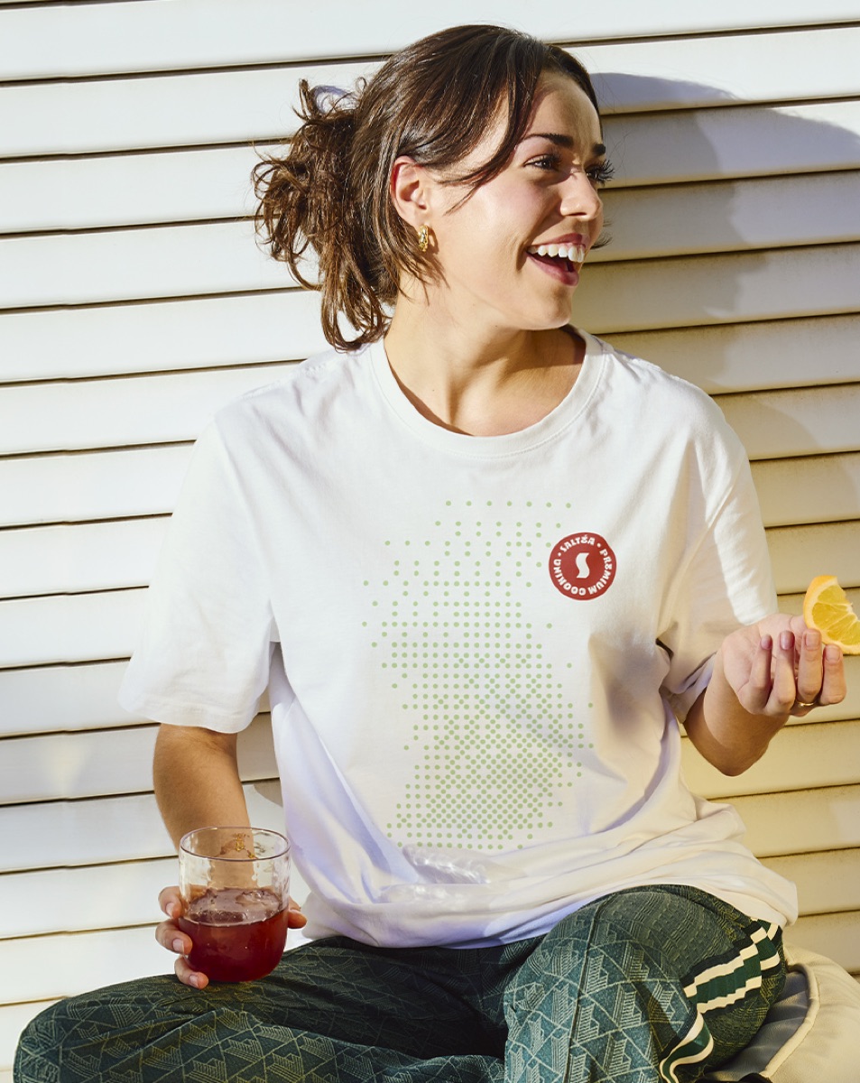
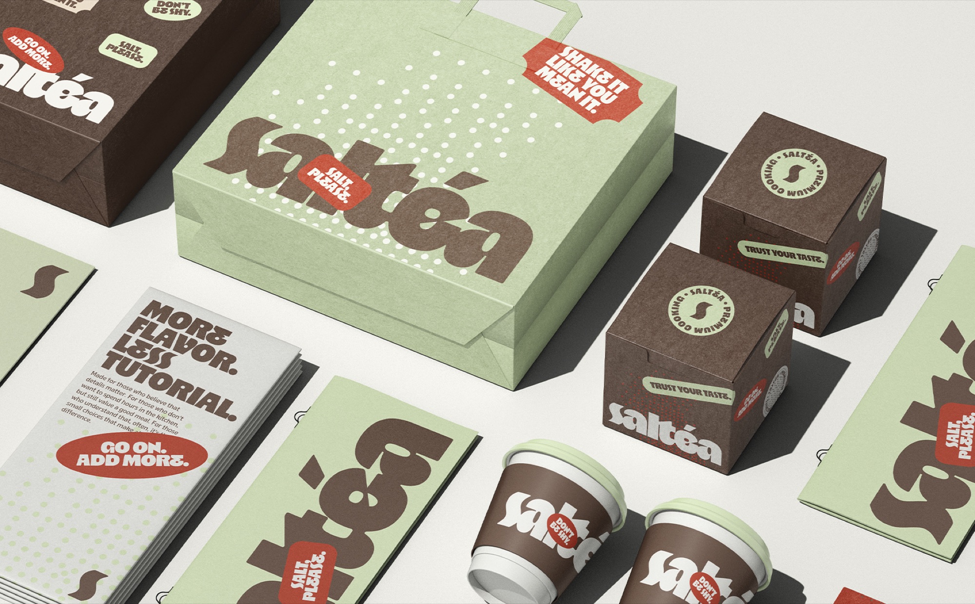
The strategy set out a positioning that combines flavor, confidence and a good-humored attitude. This personality guided the creation of an expressive visual identity: the typographic logo gives the brand presence, while graphics inspired by the gesture of sprinkling salt create movement and reinforce its connection to the kitchen. The “S” was developed as a standalone symbol, broadening the possibilities for recognition. On the packaging, colors, typography and graphic elements set the flavors apart and organize the range as a cohesive system.
Result
An identity that turns the presentation of a familiar ingredient into a more expressive brand experience. From the visual signature to the packaging, every element reinforces Sáltea's personality and gives the product a presence of its own in the kitchen and at the point of sale.
01 / 37
Next
project
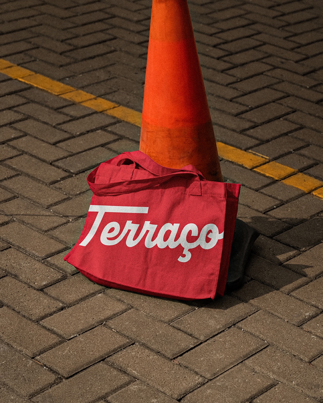
Terraço
Contact
Let's talk.
Phone
+55 83 99362-8283Every brand starts with a challenge. Tell us a little about your business, your ideas and what you want to build. We'll get to know your project and see how we can help.