Since
More than a decade connecting strategy and design to build brands.
2012
Every brand has an idea capable of changing the way it is perceived. Our job is to find it and give it shape.
The studio
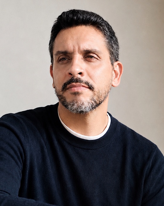
Studio Nil Brands is an independent studio founded by Nil, a Brazilian designer with over 14 years of experience developing brands for different markets and segments. Every project begins with an understanding of the business, its context and the space the brand can occupy. From there, strategy and creative direction guide the building of identities with personality, intention and consistency.
Nil — Founder and Brand Designer.
Let's talkServices
We build brands from well-founded decisions. From defining the positioning to the identity and its applications, every stage helps shape a coherent, recognizable brand.
Before defining how a brand will be perceived, it is necessary to understand what it stands for and where it intends to go. We analyze the business, the market and its audiences to establish the positioning, value proposition and guidelines that support its decisions. Strategy defines the territory the brand intends to occupy and guides how it is built.
Finding a name takes more than a good idea. Meaning, sound, cultural context and differentiation all have to be considered. We develop names based on strategic and linguistic criteria, seeking a verbal expression of its own, aligned with the positioning and with the potential to build recognition.
A brand needs a visual language that expresses its identity and is recognized over time. We start from the concept and positioning to build systems that bring together symbols, typography, colors and graphic elements. The result is an identity with its own character, ready for different contexts and applications.
An identity needs to stay coherent when it leaves the screen and becomes part of everyday life. We develop packaging, corporate materials and other applications, considering function, format, materiality and production. Each extension broadens the brand's presence without losing its connection to the visual language.
In the digital environment, identity and functionality need to work together. We design websites and digital experiences that organize information, make navigation easier and translate the brand's language into interfaces. Every decision considers both the experience of those who use it and the goals of the business.
Selected work
Every brand starts with a strategy and takes shape through design.
A brand that turns an everyday ingredient into a brand experience. Strategy, identity and packaging combine flavor, confidence and personality to give Sáltea a presence of its own in the category.
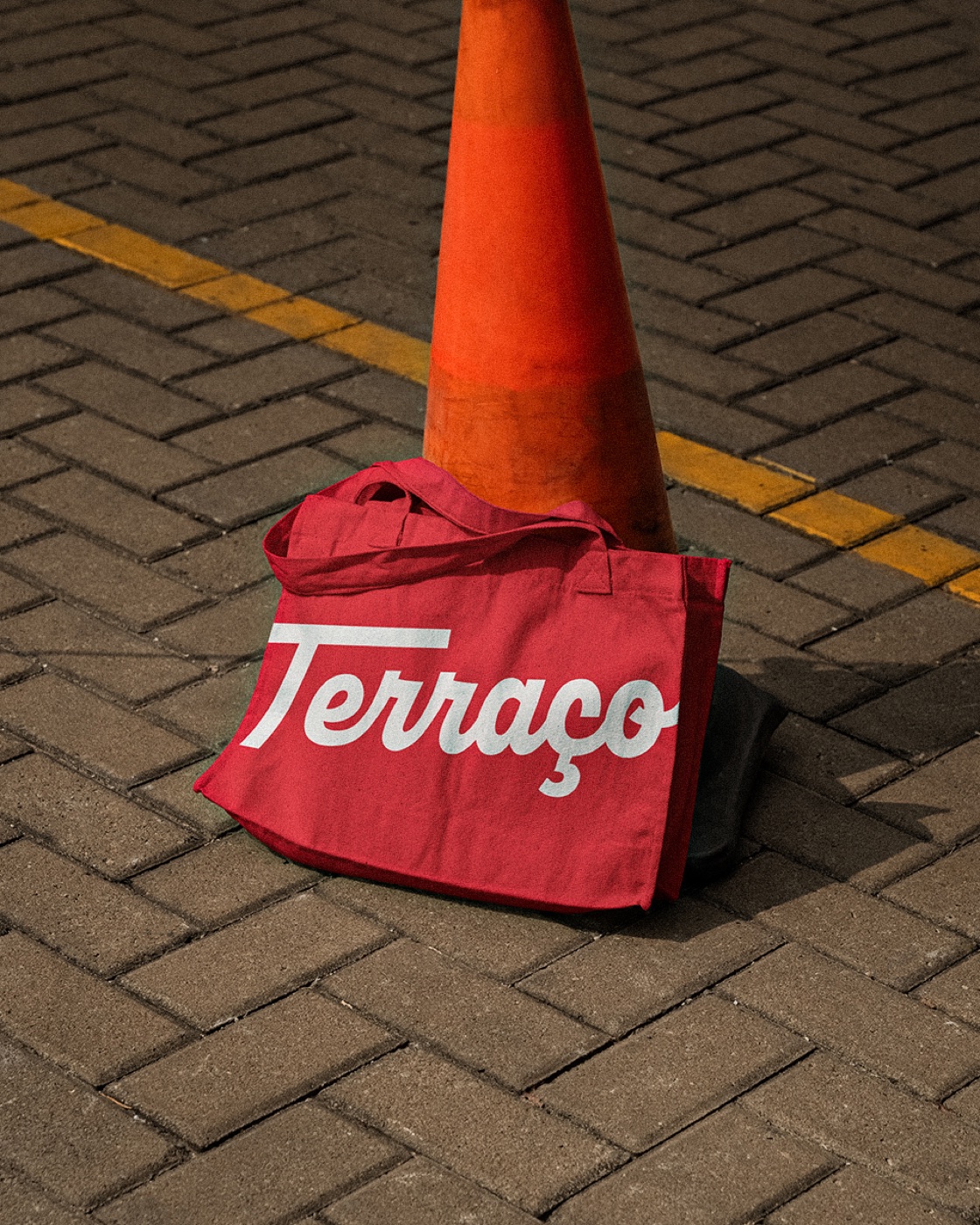
After 46 years, Terraço’s rebrand refreshes the identity without erasing its history. The new language brings the brand’s image closer to the warmth and joy it shares with families in Sete Lagoas.
An authorial brand that doesn't need to become someone else to be noticed. The custom-drawn logotype gives rise to the symbol, the patterns and a discreet identity built on choices of its own.
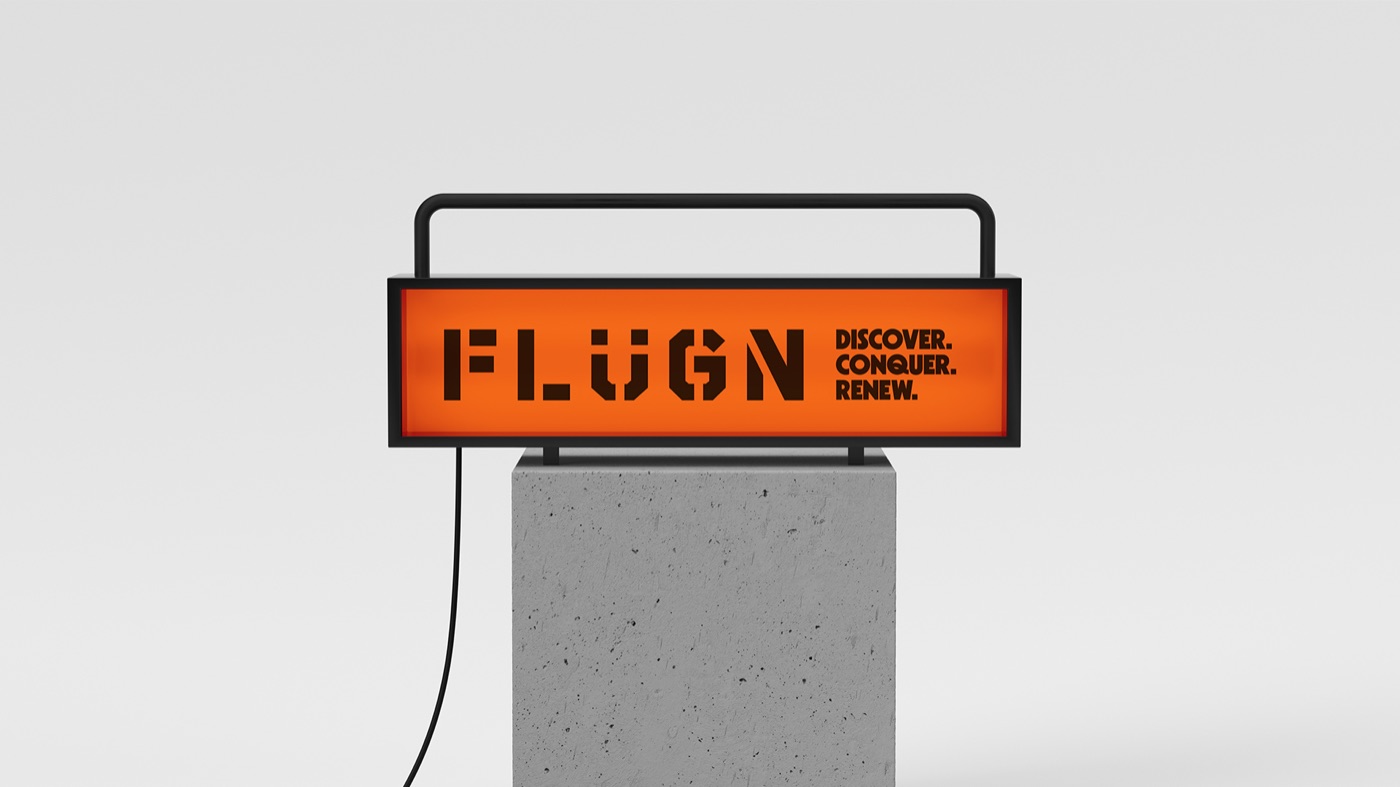
Equipment for camping, adventure and wellness with Scandinavian design. The geometric, modular identity, led by orange, translates freedom and movement for beginners and seasoned outdoor lovers alike.
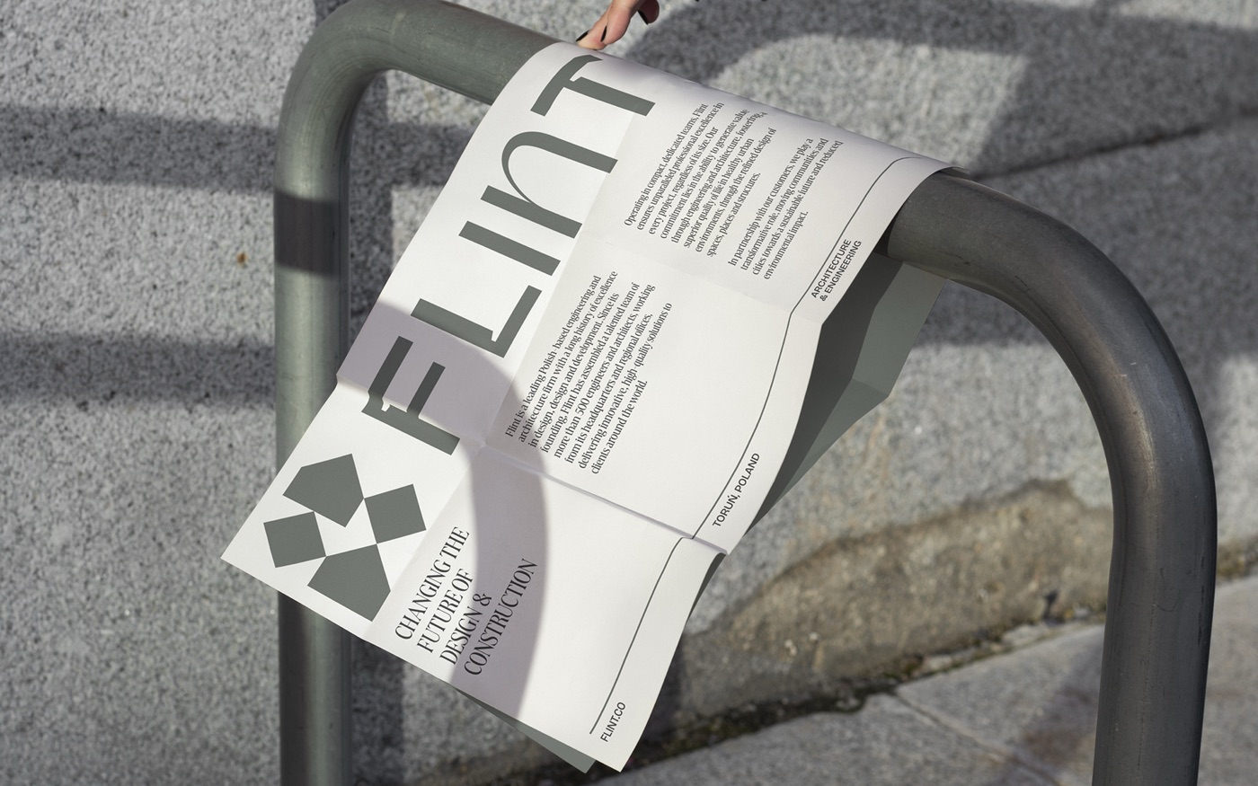
For a Polish company with more than 500 professionals, the identity balances solidity and elegance. Custom typography and an adaptable “N” express a brand ready to respond to the specific needs of each project.

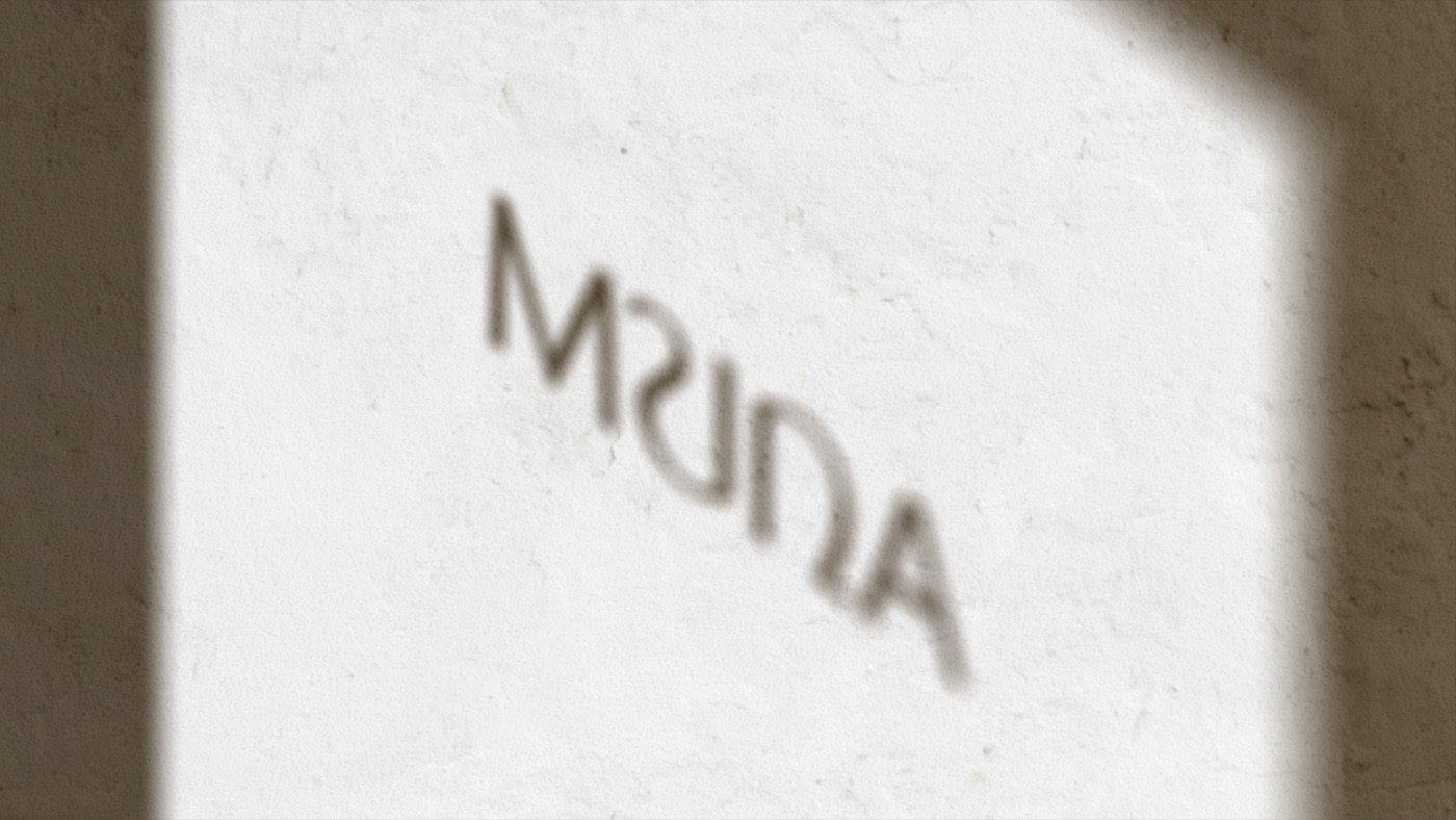
An identity that challenges the impersonal language of residential cleaning. Bold typography and vibrant colors give Mundial a youthful, approachable and professional personality for busy clients.
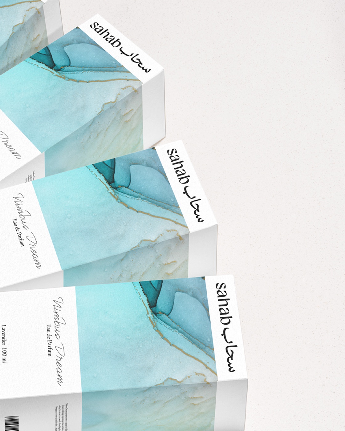
Sahab means “cloud” in Arabic — an idea that shapes the symbol, textures and packaging. The identity brings the heritage of Arabic perfumery into a contemporary, light and sensorial expression.
Inspired by the concept of air, Sha's identity connects the cultural heritage of personalized Arabic names with a contemporary expression. Custom typography and a palette of deep tones convey a jewelry brand that unites delicacy, strength and personal expression.
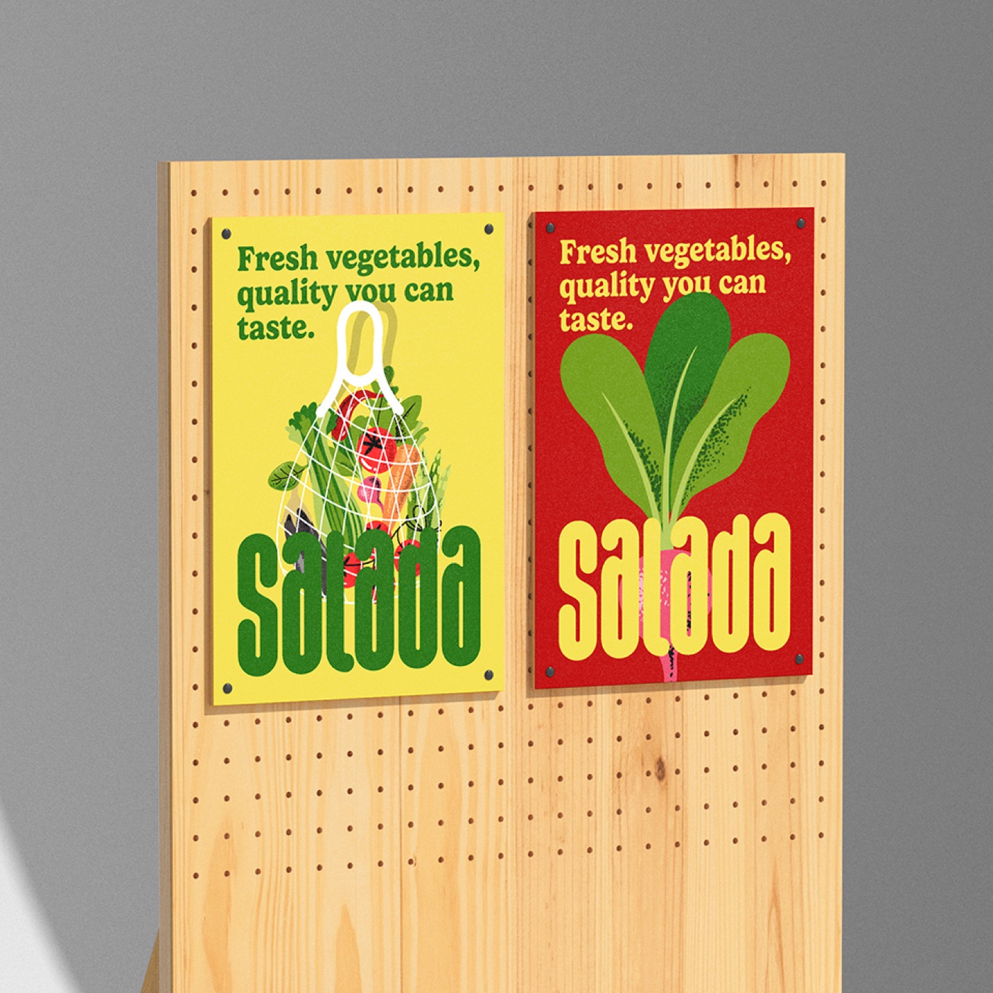
Strategy, naming, identity and packaging build a brand of vegetables grown on a pesticide-free area. Original illustrations and vibrant colors translate the attributes of freshness, health and quality into warm, accessible communication.
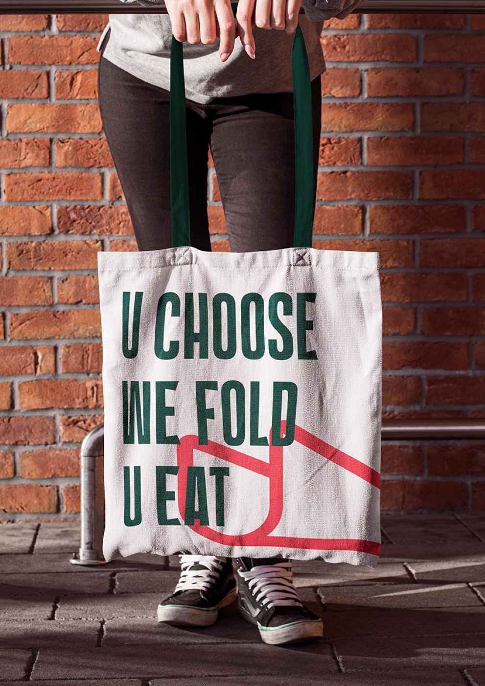
U Pizza serves folded slices topped with a filling chosen by each customer. This distinctive way of eating pizza also shapes the identity: the folded slice forms a “U” and sets the stage for a visual world of its own.
Experience
More than a decade connecting strategy and design to build brands.
2012
Branding, naming and visual identity projects developed from concept to application.
350+
Awards, publications and projects selected for curated galleries by international curators.
Countries served
Projects developed for businesses across different markets and cultural contexts.
Contact
Phone
+55 83 99362-8283Have a project in mind or a brand that needs a new direction? Tell us a little about your business, your goals and what you want to build. We'll get to know the challenge and see whether we can work together.